In addition to viewing data quality on the Quality tab and Graph and Data Correction views, you can now also view data quality as a heat map on the time bar, to get an overall picture of the current trial.
To turn on the heat map overlay:
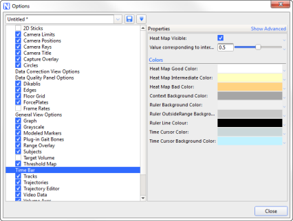
1. In the Options dialog box (F7), click on Time Bar on the left, and select the Heat Map Visible check box on the right.
2. If required, change the colors of the heat map.
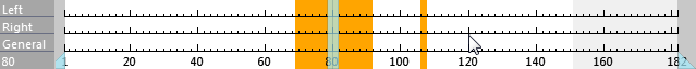
When you click on a trajectory on the Quality tab, the time bar now shows gaps for the selected trajectory.
To select multiple trajectories, on the Quality tab, CTRL+click the required blobs.
When multiple trajectories are selected, the heat map’s color gradient system is activated.
Lighter colors show where one of the trajectories has a gap but other selected trajectories do not. Darker areas show where a number of selected trajectories has a gap.
The following images show two trajectories selected. The darker area indicates gaps in both trajectories.

As more trajectories are added the view starts to morph from individuals gaps for one or two trajectories, to areas in the volume/time where there are issues.